Tabs are one of the more common ways to separate pages or content on an iOS app. Pre-SwiftUI, tabs would be implemented using a UITabBarController.
In SwiftUI, tabs are implemented using TabView and corresponding tabItems.
struct ContentView: View {
    var body: some View {
        TabView {
            TabContentView()
                .tabItem {
                    Text("Tab 1")
                }
          	TabContentView()
                .tabItem {
                    Text("Tab 2")
                }
        }
    }
}

struct TabContentView: View {
    var body: some View {
        Text("Hello World!")
    }
}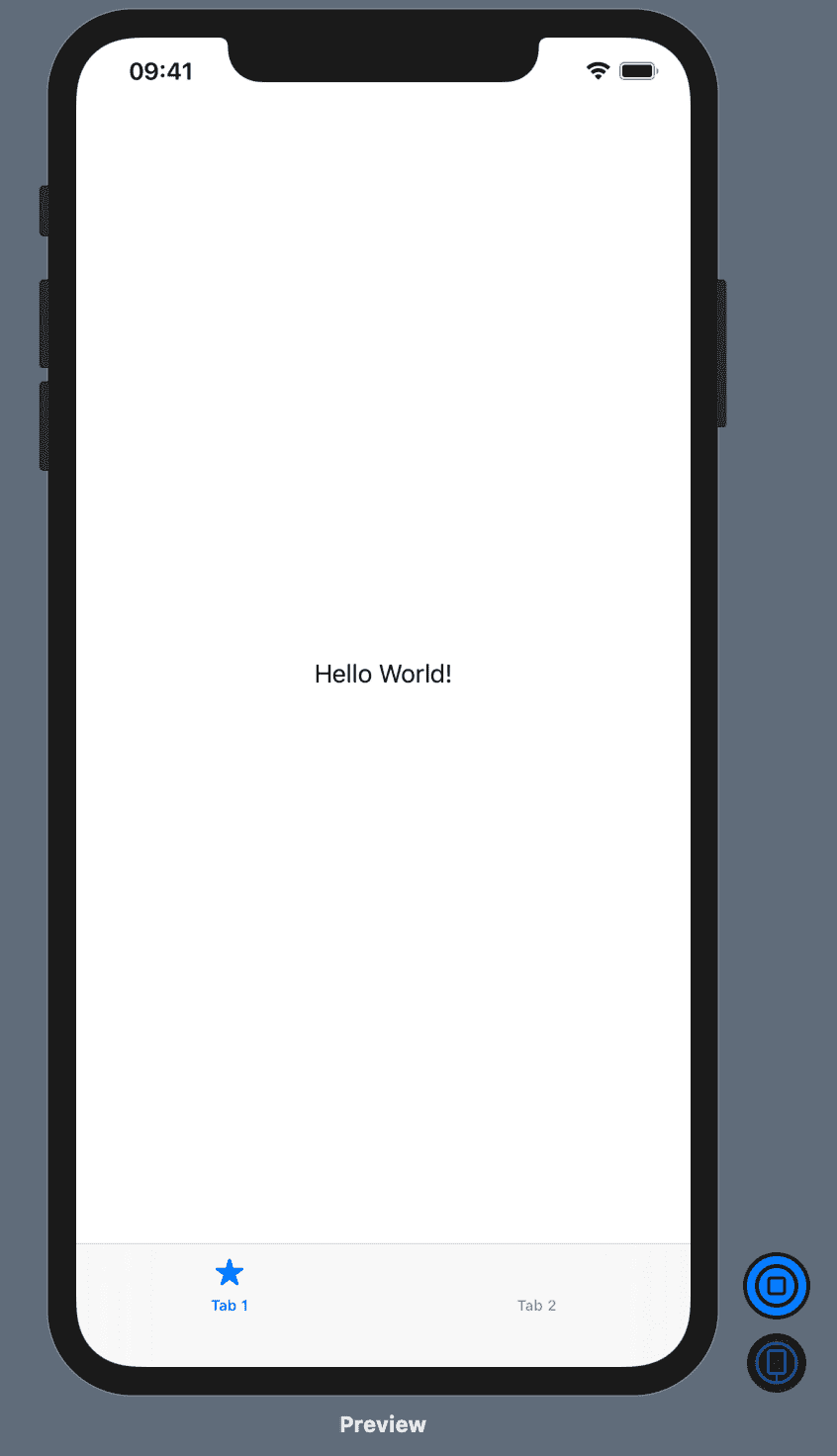
Tab Views require a view object (ex. TabContentView) and you can specify the tabItem inside the closure of that view object.
The tabItem requires a View, which is what will be used to show that specific tabBarItem UI. In the above example, it’s just a simple Text.
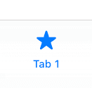
To get the traditional icon and text, you could do a ZStack of Image and Text like so:
.tabItem {
    ZStack {
        Image(systemName: "star.fill")
        Text("Tab 1")
    }
}